
Product card theme settings
Before Whisk v6.3.0, the settings for "Product cards" could be found under the "Products" header in theme settings.
Enable quick add button on product cards
Check this to allow for visitors to add products to their cart from any product card, not just on the product page.

Center text on card
Check this box to center text below the product image, instead of having the text left aligned.

Show review rating
Check this box to show the product review rating on the card. This feature only works when a third-party reviews app is installed in the theme. For more details, see our Product reviews documentation.

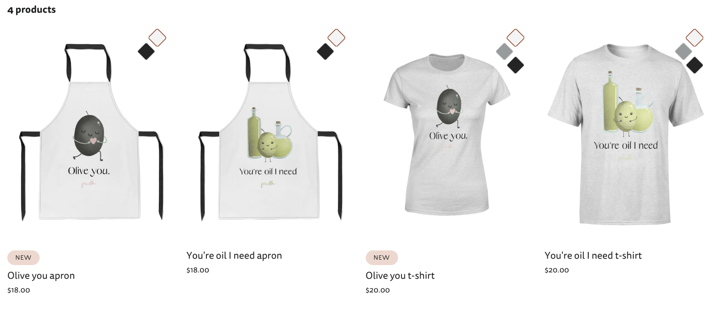
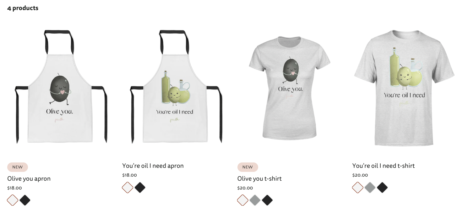
Show swatches
When this is selected, swatches will show on products when they are in a collection section, like on the collection page or a featured collection. When a swatch is clicked on, it will update the image on the product card to the variant image for that swatch, if available.
Swatches placement on product cards
Choose whether to show the swatches on top of the product image, or below the product details.
Number of products per row on mobile
Choose whether or not 1 or 2 products are shown on phone screens within a collection.
Product name font size
Select a font size for the product name on the product cards.
Product placeholder image
Upload an image here that will be used on product cards whenever there are no images on the product itself. If there is no product placeholder image, the image placeholder background gradient or color declared in Color theme settings will be used.
